
Logo & Identity
Torin
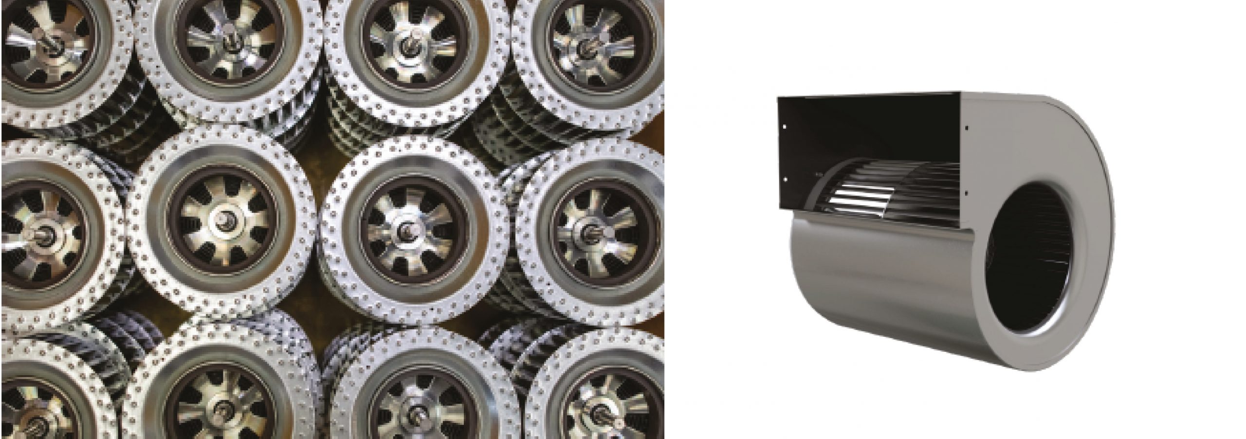
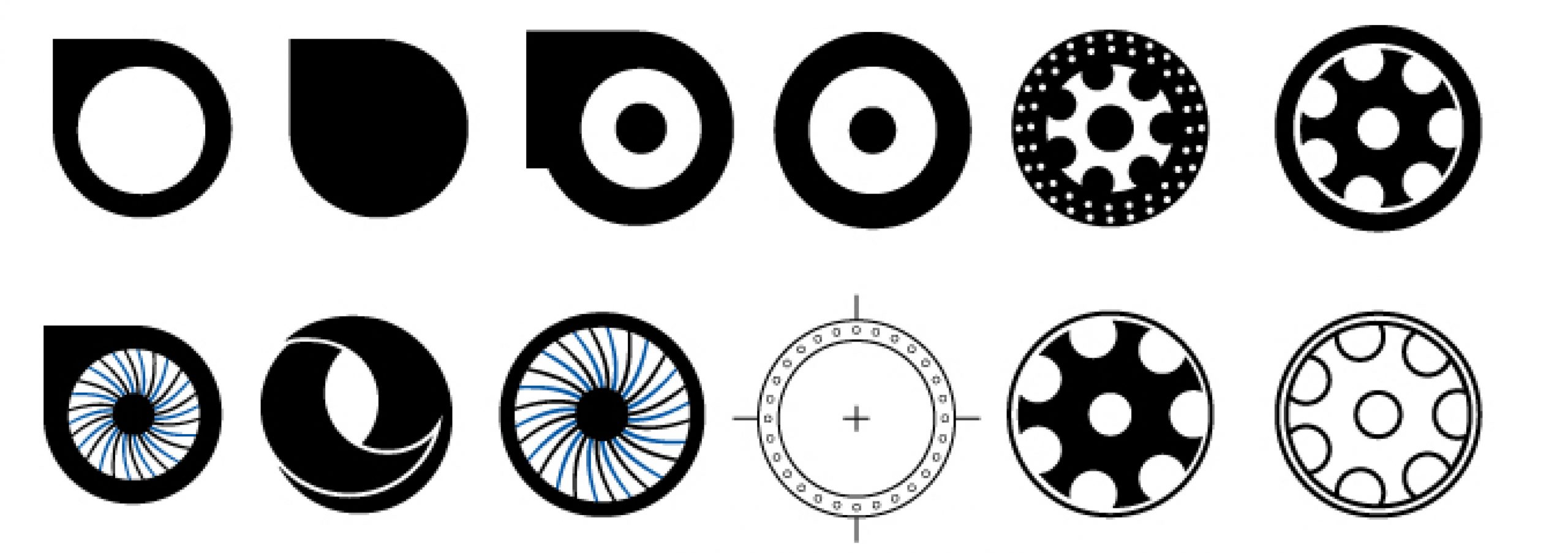
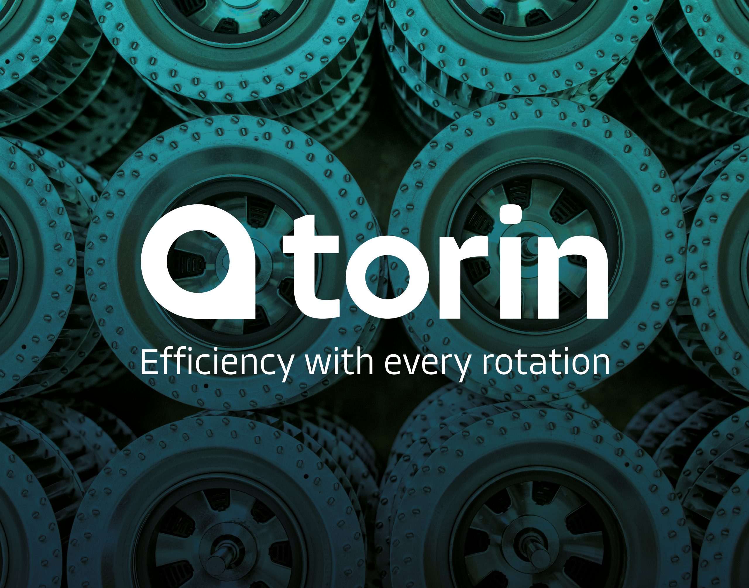
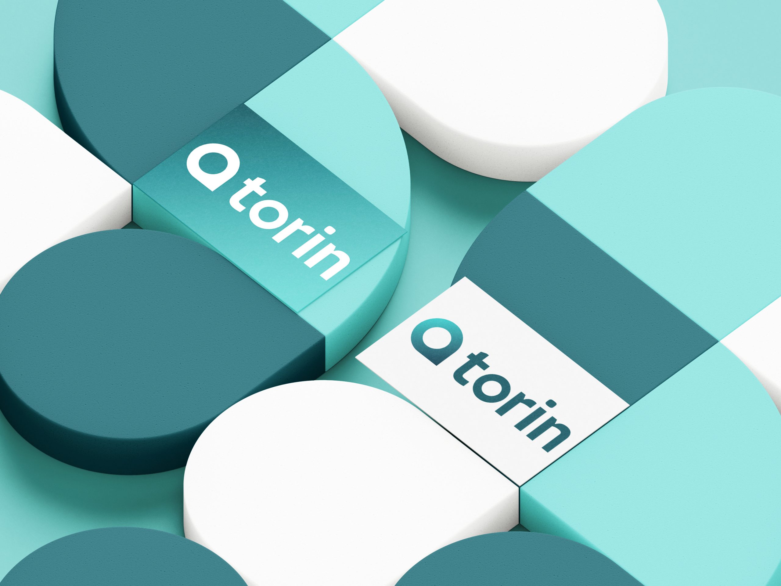
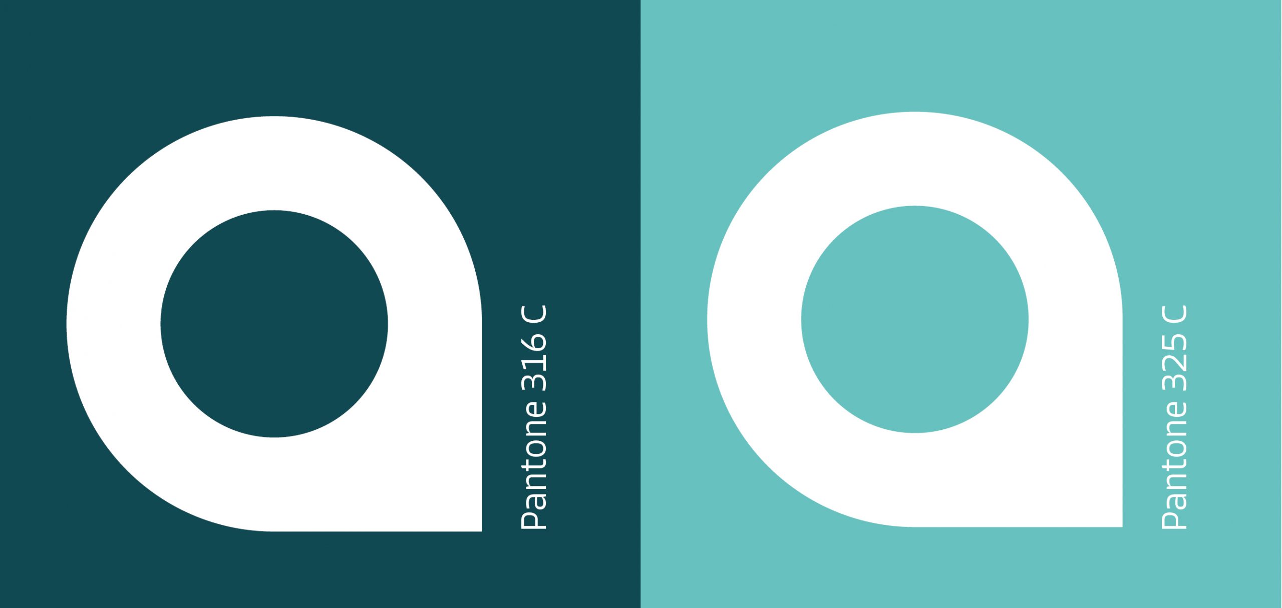
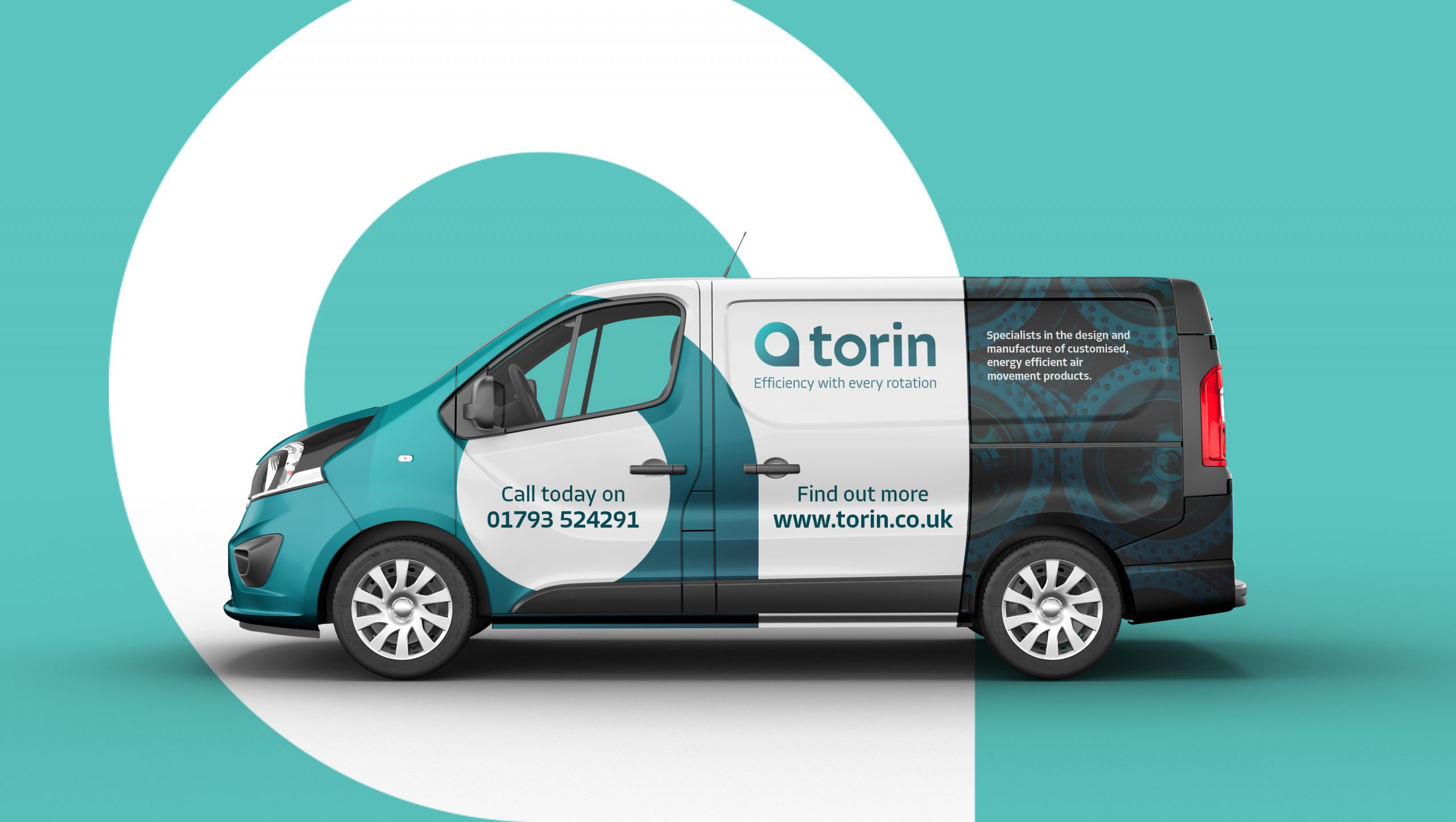
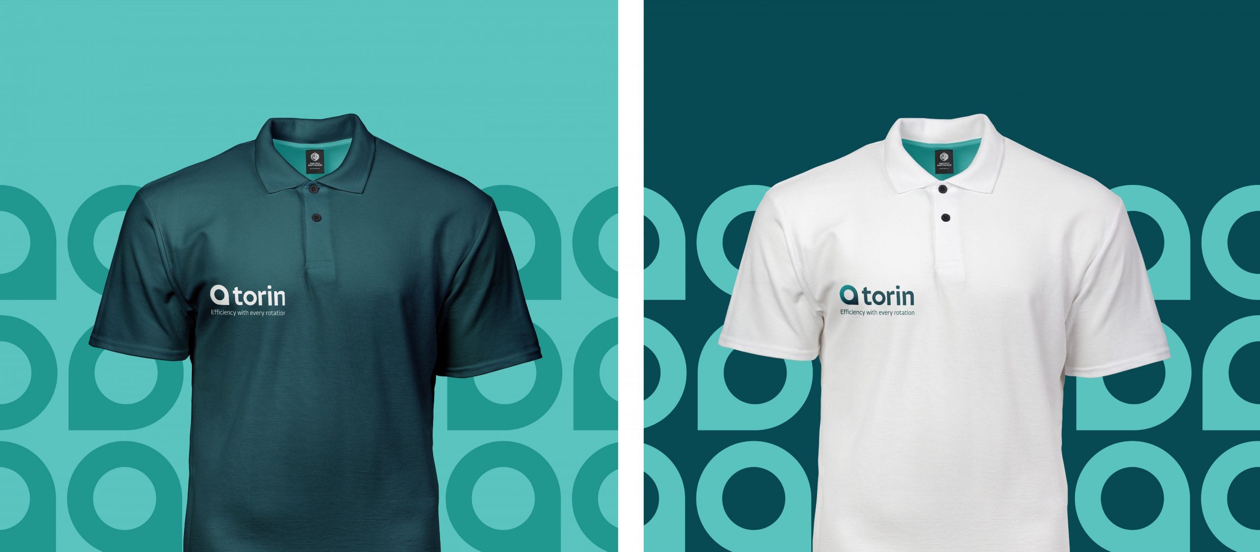
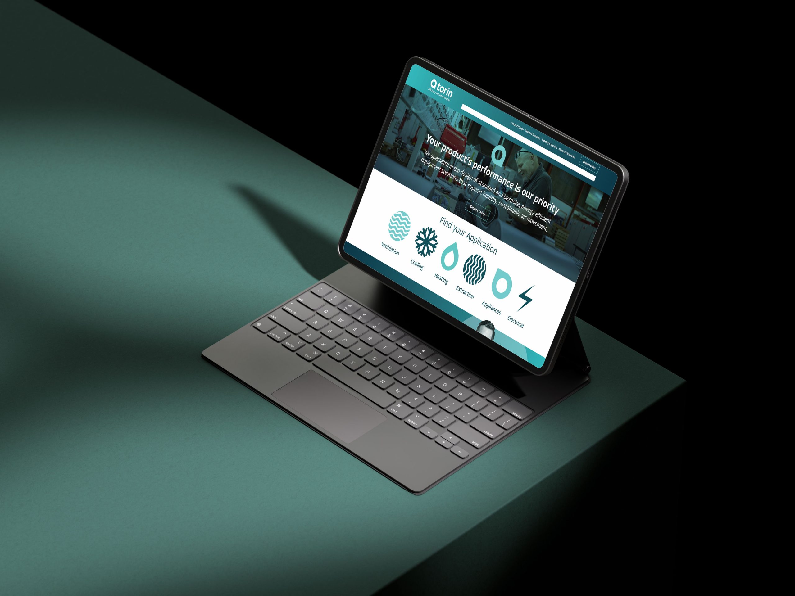
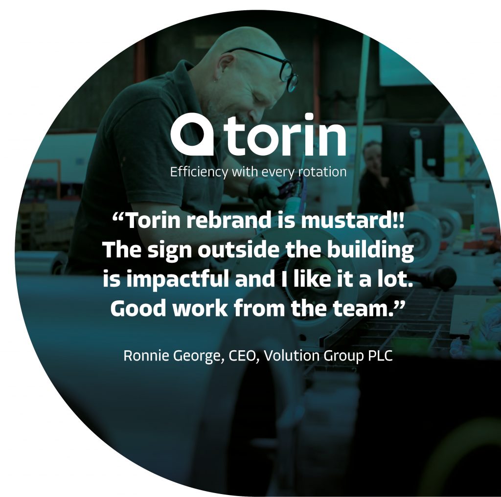
Torin is a motor manufacturer based in the UK. I was tasked with transforming the branding and logo to better represent the brands ethos and core values during a pivotal time of transformation at the company. The key elements of the brief were to emulate “quiet confidence” in their ability, demonstrate “high technical accuracy”, “energy efficiency”, and “technical superiority”, as well as be symbolic as an “industrial brand”. Torin’s main product, a “fan scroll” which encompasses a “snail shell” shape, inspired the final logo mark. The typography was selected to emulate the rigidity and precision of an industrial brand, and is a lowercase typeset to help embody the “quiet confidence” set out in the brief.
Logo Development
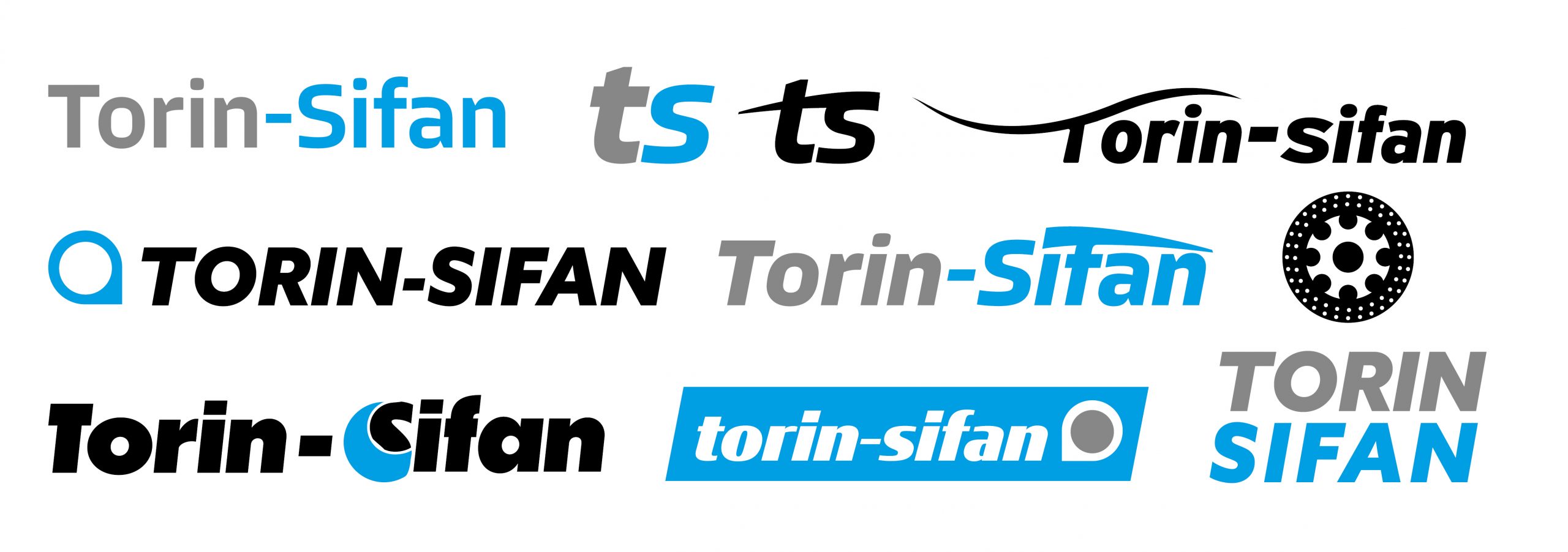
Initial logo development focused on the old name “Torin-Sifan”. The word “Sifan” was later dropped as the project progressed.
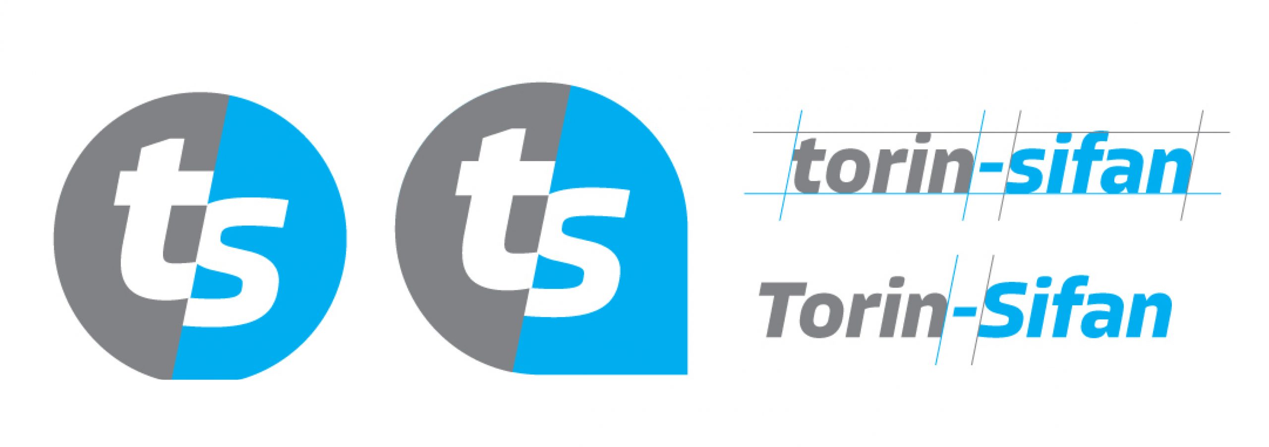
By this point the fundamentals of the final logo had been established.